
понедельник, 18 июня 2012 г.

четверг, 14 июня 2012 г.


Photographic Essay


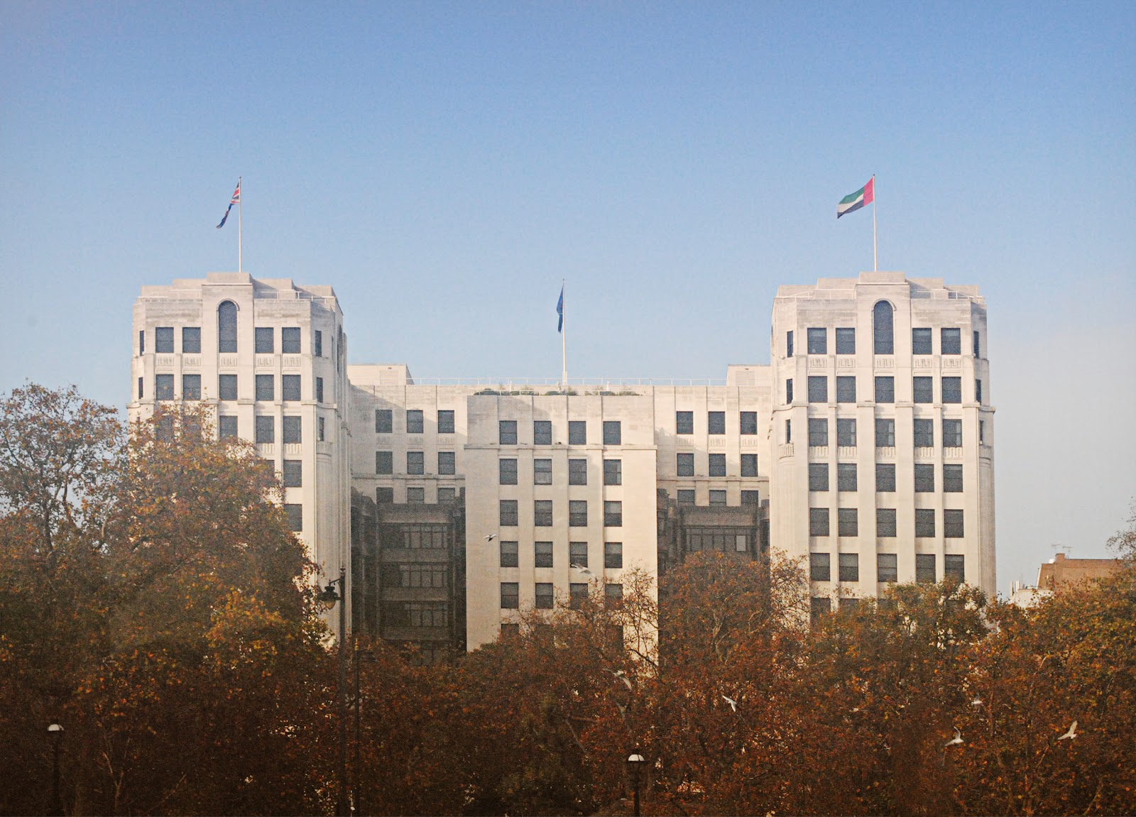
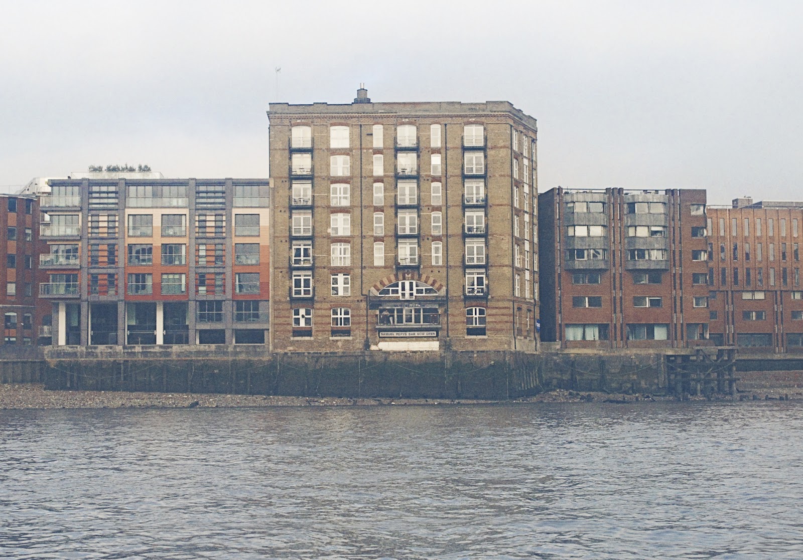


These are pictures of My photographic essay. The topic was "Windows", I have chosen it because I really like english architecture, and the variety of the elements it consists of. Also I like architecture itself, geometrical forms and patterns.
To complete this task I went to London for an inspirational walk. First time I took with me Canon EOS 600D, second time Nikkon D3000.
In my work we can spot several weekneses like noise, motion blur, defocus. This is mainly because photos were taken at the beggining of the year, when I was not really familiar with photography. If I would do it now, I would do it better.
Also photos had been edited in photoshop. First of all I edited the perspective, and cropped them to achieve composition I need. Then I did a color correction, to make them look more artistic, and adjusted the sharpness at several places.
среда, 13 июня 2012 г.
Final Evaluation
The aim of the project was to create a storyboard for the new Bond film title sequence. So I begun with doing research on different Bont idents from sixties and till nowadays. I also did research on different artists, who created them. The one I liked the most was Robert Brownjohn because of his experimental approach and stylish typography. In my final one I was inspired by his work. I used the old sixties color palette and sans-serif typography.
So after doing my research, i found that title sequences gets viewer prepared, when the film itself begins. by telling an abstract story related to a plot. Thats why i wrote my own short-story aout Bond. After that I started doing my experiments with patterns, photography and illustration. I have chosen my best pieces and created a storyboard out of them. But they were rejected. Then I started to experiment with a photography
and came out with pretty nice results. I put them all in a storyboard, edited, to make them look more clear, and printed out.
About my design - I like the way, how I achieved result. I tried to use techniquec, that could possibly be done without photoshops in early times. It was very fun creating them, and they came out quite stylish.
Areas to improve - put more emphasize on quality, or try different techniques. Also the work requiers more neat typography, because current one does not look its best.
So after doing my research, i found that title sequences gets viewer prepared, when the film itself begins. by telling an abstract story related to a plot. Thats why i wrote my own short-story aout Bond. After that I started doing my experiments with patterns, photography and illustration. I have chosen my best pieces and created a storyboard out of them. But they were rejected. Then I started to experiment with a photography
and came out with pretty nice results. I put them all in a storyboard, edited, to make them look more clear, and printed out.
About my design - I like the way, how I achieved result. I tried to use techniquec, that could possibly be done without photoshops in early times. It was very fun creating them, and they came out quite stylish.
Areas to improve - put more emphasize on quality, or try different techniques. Also the work requiers more neat typography, because current one does not look its best.

четверг, 7 июня 2012 г.
Graphic Design Companies Research
1) Scada.lv
Is Latvian based graphic design company, that covers variety of fields: Graphic design, Websited, Branding, Logos.
They follow minimalistic and sharp style, so they works always looks clear and professional.


2) http://www.artlebedev.com/
Russian based design company, that follows traditional ways of doing design.
"We offer advanced industrial, graphic, web, and interface design. We work to find the most simple, elegant, and convenient solution to any problem without losing the purport. As a matter of principle, we don’t work with private persons, political parties, religious organizations, jerk-offs, and those whose views conflict with ours."


3) Tannwestlake.com
UK based graphic design company, that specialises on a brand and website design. It does print design, logos, posters and web graphics.
"Tann Westlake is an integrated design agency based in Rustington, West Sussex. We design and develop campaigns across all forms of media including; Website Design, Brand Development, Logo Design, Advertising, Marketing Communications, E-marketing and E-commerce websites"


Is Latvian based graphic design company, that covers variety of fields: Graphic design, Websited, Branding, Logos.
They follow minimalistic and sharp style, so they works always looks clear and professional.
2) http://www.artlebedev.com/
Russian based design company, that follows traditional ways of doing design.
"We offer advanced industrial, graphic, web, and interface design. We work to find the most simple, elegant, and convenient solution to any problem without losing the purport. As a matter of principle, we don’t work with private persons, political parties, religious organizations, jerk-offs, and those whose views conflict with ours."
3) Tannwestlake.com
UK based graphic design company, that specialises on a brand and website design. It does print design, logos, posters and web graphics.
"Tann Westlake is an integrated design agency based in Rustington, West Sussex. We design and develop campaigns across all forms of media including; Website Design, Brand Development, Logo Design, Advertising, Marketing Communications, E-marketing and E-commerce websites"
Подписаться на:
Сообщения (Atom)