понедельник, 28 мая 2012 г.

types of storyboards

1) graphic one


2) Roughly sketched


3) Comix styled


4) Photographic storyboards

Typography styles

ways of using typograpy
Calligrapy. Hand drawn letters together with vingettes makes up very nice result, that is quite suitable for oldschool logos, or logos for rich and expensive brands.

Muslim people were not allowed to draw any images at all, so they used their alphabet to make patterns from letters, as you can stretch any letter as long as you want and it still will be recognised


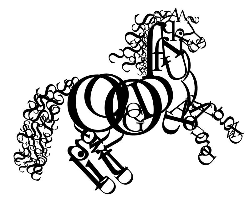
Other way of making typographic imagery is to distort existing fonts into a shapes, that sreates any recognisable form. Like tatoos.

Other examples of typography techniques we can see on the streets - graffity:

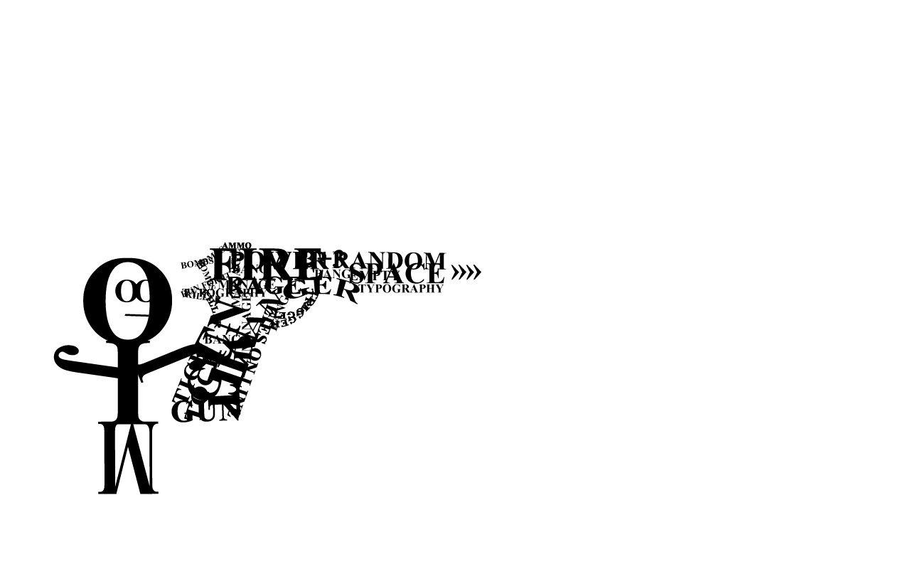
Or you can just pick any letters and use them as a mosaic, combining them into a shapes:

Jo Spense

Storyboard

This is my final storyboard

BEGINNING OF TITLE SEQUENCE

The title sequence begina as we fly throgh the clouds.
Suddenly we see 2 helicompters chasing each other.
One us run by a vilian, other one by bond.
After while Bond jumpes from one helicopter to the other one,
kills the vilian, takes his case,
jumps out with parachute and helicopter blows up.
Bond lands on a ground  near his Aston Martin,
drives through the city to the party, that is happening in a big hall.
He drinks martini and gets the chicks.

END OF TITLE SEQUENCE

Typography experiment

 This is my typographic image. I did this in photoshop using text tool, wrap and different blending modes. I was inspired by Dominic Mcgill artworks. I like the way he uses text to create lines and shapes.

Lowtech paintings

Robert Brownjohn research

Comparing title sequences

четверг, 24 мая 2012 г.

среда, 23 мая 2012 г.

What is narrative image Making

Getting the narrative! – intended meaning and perceived meaning by the viewer
In image making when the artist or film director wants to portray a feeling, emotion or imply a narrative thread – there are several commonly used techniques that if used separately or together can help the viewer to receive the messages

To help viewer recieve more from narrative image making We can adjust lighting to make more emphasize of what we want to show. We can ezperiment with camera angle and movement. More fast and unstable camera motion gives us more action. Better storytelling can be also achieved by using certain type of music starting from something like classical music for calm and romantic scenes and rock or techno for fast action.

Red Hot Chili Peppers Monarchy of roses


This video is a great example of combination 2d animation and live action videoshots. We can see musicians interacting with hand drawn animated background and that gives us unusual look and adds more emotions to the video. The thpography is also handmade, and combined with footage it helps to emphasize the meaning of the song in more visual way.

понедельник, 14 мая 2012 г.

Dominic Mcgill

Dominic McGill
Dominic McGill
Dominic McGill
Dominic McGillDominic McGill

Title sequence Rubicon


A short title sequnce based on Rubicon intro. I tried to use photographic background, grungy enough to look cool and combined it with clean and minimal typography.

Storyline

BEGINNING OF TITLE SEQUENCE

The title sequence begina as we fly throgh the clouds.
Suddenly we see 2 helicompters chasing each other.
One us run by a vilian, other one by bond.
After while Bond jumpes from one helicopter to the other one,
kills the vilian, takes his case,
jumps out with parachute and helicopter blows up.
Bond lands on a ground  near his Aston Martin,
drives through the city to the party, that is happening in a big hall.
He drinks martini and gets the chicks.

END OF TITLE SEQUENCE

четверг, 10 мая 2012 г.

Art movement timeline

Minimalism

The Minimalist happened in 50's of past century and continued till 70;s. As we can see, it happened during the so called "Cold war"
Minimal art is recognized by its simplicity in both form and content, where personal expression is removed in order to achieve this. 
.

Minimalism is similar to Conceptual Art in that the outcome is used to express a theory. Minimalism is also similar to Pop Art because of the impersonal attitude, and Land Art because of the use of simple forms. Minimalist artists of the time reacted against Abstract Expressionism, which is demonstrated by the stark canvases, simple installations, and minimalist sculptures. Some of the most famous minimalist artists include

Dan Flavin,


Carl Andre,

Donald Judd

, and Ellsworth.
 

Inspired by

My work was inspired by Western typorgaphy examples. I have used capital letters and a bold serif fonts.
Also I have used wood texture and simple geometrical patterns to add decoration to design. Here are some examples, i were inspired with:


Transition to Modern Style

The 17th and 18th centuries introduced new trends in Western typography: the letters received greater contrast between thick and thin strokes, bracketed serifs turned into fine almost straight lines, and the stressing became vertical. William Caslon, Johann Fleischmann, and John Baskerville made notable contributions to the development of the so-called transitional Roman typefaces. Caslon-Bold, Dustismo Roman Bold, Sanskrit Roman Bold Italic fonts inherit the best traits of this particular tradition in western typography.


Western Typography in 19th-20th century

Due to the rapid development of industries in the 19th and 20th century, typography again made a significant step forward. Though experts say that this period was not marked with any novelties in the typefaces design, great progress was made in terms of typographic technology. After the invention of lithography in 1796, typography was popularised over a wide range of applications from newspapers to posters and advertisings.
Modern days of Western Typography

With the appearance of personal computers at the end of the 20th century, a new round of western typography has begun. Now, font designers are no longer limited with the specifications of the metal types, a new font or typeface can be designed in a relatively easy way with the help of specialised computer applications or font editors. Computer fonts are now widely used by every user of personal computer, which gave the push to the appearance and growth of the huge free font repositories in the Internet, such as Fonts2u, where anyone can find a great variety of digital fonts, download them and use in personal documents or designing projects.

среда, 9 мая 2012 г.

Sam Hayles


Sam Hayles is an independent design consultant and graphic designer and has experience in working with bands, record companies, DJs, Artists, Music composers since 1999…

Based in Edinburgh/Scotland after having lived and worked in France for over a decade, his capabilities span from concept development to design/direction, animation and illustration. He is also a practicing visual artist working across different mediums.

Maurice Binder

Maurice Binder (August 25, 1925 – April 4, 1991) was a film title designer best known for his work on 14 James Bond films including the first, Dr. No in 1962 and for Stanley Donen's films from 1958. He was born in New York City, USA, but mostly worked in Britain from the 1950s onwards. The Bond producers first approached him after being impressed by his title designs for the 1960 Stanley Donen comedy film The Grass Is Greener.

Bond film he worked on:
Dr. No (1962)
From Russia with Love — gun barrel sequence only (reused from Dr. No) (1963)
Goldfinger — gun barrel sequence only (reused from Dr. No) (1964)
Thunderball (1965)
You Only Live Twice (1967)
On Her Majesty's Secret Service (1969)
Diamonds Are Forever (1971)
Live and Let Die (1973)
The Man with the Golden Gun (1974)
The Spy Who Loved Me (1977)
Moonraker (1979)
For Your Eyes Only (1981)
Octopussy (1983)
A View to a Kill (1985)
The Living Daylights (1987)
Licence to Kill (1989)
Here we can see Dr.NO title sequence
http://www.youtube.com/watch?v=2dSpoKZWb2Y

Many of the iconic aspects of a typical James Bond film were established in Dr. No, beginning with what is known as the gun barrel sequence, an introduction to the character through the view of a gun barrel, and a highly stylized main title sequence, both created by Maurice Binder.

James Bond Title Sequences


comparison in length of 20 James Bond opening sequences. live edit in the background.

07/13/2004
featured: Dr. NO
featured: From Russia with Love
featured: Goldfinger
featured: Thunderball
featured: You Only Live Twice
featured: On Her Majesty's Secret Service
featured: Diamonds are Forever
featured: Live and Let Die
featured: The Man with the Golden Gun
featured: The Spy Who Loved Me
featured: Moonraker
featured: For Your Eyes Only
featured: Octopussy
featured: A View to a Kill
featured: The Living Daylights
featured: Licence to Kill
featured: Goldeneye
featured: Tomorrow Never Dies
featured: World is not Enough
featured: Die Another Day

четверг, 3 мая 2012 г.

VIP 1

My first variation. I dit it in photoshop using Aston Martin pictue.
To make it more expensive, i used dark colors and tones, and very simple, sans-serif typography.

VIP 2

Second flyer variation. I was looking at the flyer pictures, and find out, that gold texture is quite suitable in this case, so un photoshop I made one using gradients and transperancy.

Teamwork diagram

Team Evaluation

­Working in Collaboration in Art & Design

Reviewing & Evaluating the Design Project
Answer the following questions this will help you to complete the evaluation required


1. What were the strengths and weaknesses of your contribution – include at least 3-4 of each.


Your Strength
In what way was this aspect a positive strength and supported the task?

Defining roles

That helps to find out what tasdks each of us could do better.

Doing design

Good design is always a key to success.

Completing work on time

Dealing with deadlines is also important.


Your Weaknesses
How could this aspect be over come?

Lack of ideas

To do more research and look for inspiration

Lack off attraction to project


Find out things, that you like about project, and why would you like to do it


2. What were the strengths and weaknesses of the team – include at lease 3 of each.


Team Strength
In what way was this aspect a positive strength and supported the task?

Good combination of people

It is always good to have people, that are able to work together.

Knowing, we are a team


So we can always expect for a help from each other
Communication


Good communication skills are always vital.


Team Weakness
How could this aspect be over come?


Lack of teammates

Look around for a new people

Lack of ideas


RESEARCH & INSPIRATION

Photography

Find someone, who is good at it


Working with team

We talked about the roles and responsibilities of the group – made a list of things to do and shared out the tasks

Agenda
Design Work:  Dmitri
Research: Dmitri& Cody
Resources and Materials needed: Computer, Photoshop, Word, Internet
Choice of style of design: clean and expensive, VIP style
Typography style: Sans-serif
The outcome was a few variations of flyer

The progress of the design work is coming together – although there are aspects I am not pleased with these are lack of time and creative ideas
Areas that are progressing well are design and research part.

The team are working together well – there was a problem with finding new team members, so there were only 2 of us

We have kept in touch while in college during lesson time and have sat together as a team to work on the project ideas. We have all exchanged mobile numbers and have linked our Blogs and emails in case anyone was off sick

We have followed the health and safety guidelines for the workshops that we were appointed – we did not use any dangerous chemicals or paints with harmful fumes